Branding & Logo Design

Your brand is the

fingerprint of your company.

How do you create a brand?

PHASE ONE: We start with figuring out your design problem. For example, I will showcase a rebranding project I did while working at Paragon Digital Marketing in 2023 for Kapiloff Insurance. Kapiloff was passed down to a new generation. They wanted a fresh look reflecting the change while still keeping the essence of the existing business and showcasing their mission.

Kapiloff’s Mission: We help people across the state find affordable and reliable insurance products from a variety of trusted carriers. As an independent agency, we can help you find the perfect combination of coverage and price to fit your unique needs.

PHASE TWO: Research, interviews, and vision. I want to use your time effectively. To do this, I need to understand you, your customers, and your competition before putting pen to paper so we can solve your design problem. This is a very collaborative process. For Kapiloff Insurance, we researched what other insurance companies, locally and nationally, were doing. We looked at what colors they used and how successful they were at showcasing their values. We interviewed the staff and owners and gathered insight into the business's long-term and short-term goals.

PHASE THREE: Solution & Design. Finally, we put all that research to work! We start to develop how we will visually represent your brand. This can be through (but not limited to) your logo, packaging, customer service style, colors, fonts, voice, etc.

PHASE FOUR: Strategy and Release. Lastly, we create brand guidelines, pull together your strategy, and figure out a launching plan.

Branding is often one of the last things small business owners consider while building their business. Why? Because most people don’t realize your brand is more than just colors, fonts, and a logo - it’s about showcasing the essence of your business. Your brand represents why you do what you do, how trustworthy you are, tells your story, and gives the viewer an emotional reaction or connection.

This was Kapiloff’s original logo, often used with a dark red. They wanted something that was cleaner, recognizable, could use the “K” only, invoked trust, & was easy to read.

This is Kapiloff’s new logo that I designed. Kapiloff Insurance's brand is now clean, modern, bold, but approachable. The blue evokes security and trust. The white space used in the "K" and "FF" create a sense of forward movement, identity, originality, & uniqueness from competitors.


One size doesn’t fit all.

When designing your logo, it's crucial to think beyond just its appearance. Your logo should be versatile and adaptable to different backgrounds, uses, and sizes. With Kapiloff Insurance's logo, I created personalized tags for each department and even holiday-themed logos. Your logo should reflect your brand and its values, so take the time to create something that truly inspires and resonates with your audience. Remember, a great logo can make a lasting impression and set you apart from the competition.

Color Theory

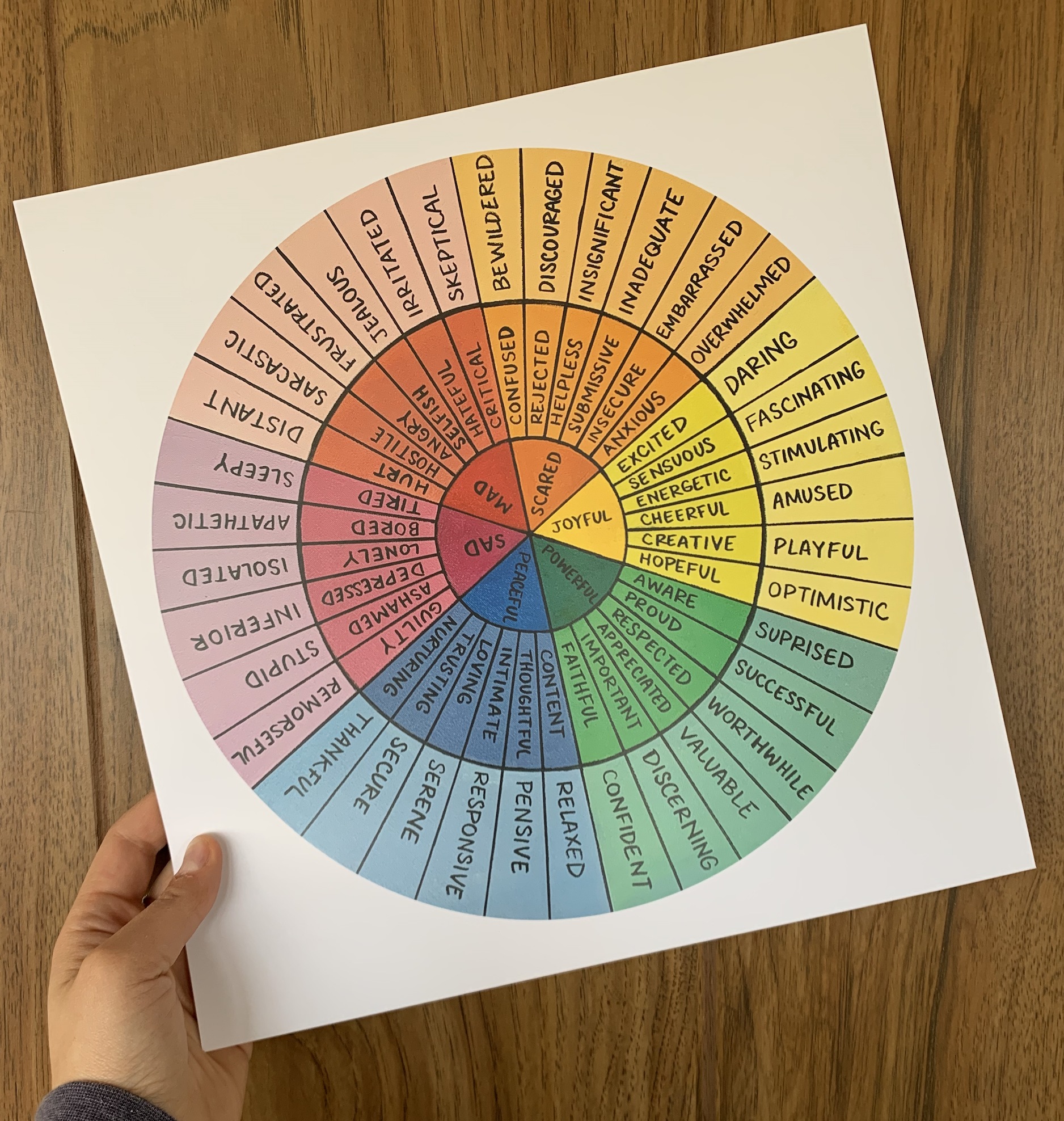
Color theory is the science and art of using color. It explains how humans perceive color, the visual effects of color mixing, matching, & contrasting, as well as the messages colors communicate, & the methods used to replicate color.

We utilized color theory to select the appropriate colors that represent the brand. Blue was chosen as it represents trust, loyalty, sincerity, wisdom, confidence, and stability. We ensured that the colors were ADA-compliant for easy readability on different backgrounds & documented how they are to be used in their branding kit.



Have questions?

Want to talk more about branding?

Previous
Previous

Personal Photography

Next
Next

Graphic Design & Illustration